
The Comets is a brand identity project focused on reimagining a legendary Houston basketball team for a contemporary audience. The project began with in-depth research into the team’s history, achievements, and existing brand identity, followed by an analysis of what elements remain effective and which feel outdated when measured against current design trends and audience expectations. Using this research as a foundation, I developed a refreshed visual identity that honors the Comets’ legacy while presenting a cleaner, more modern direction.
The Comets is a brand identity project focused on reimagining a legendary Houston basketball team for a contemporary audience. The project began with in-depth research into the team’s history, achievements, and existing brand identity, followed by an analysis of what elements remain effective and which feel outdated when measured against current design trends and audience expectations. Using this research as a foundation, I developed a refreshed visual identity that honors the Comets’ legacy while presenting a cleaner, more modern direction.
I.
I.
HOUSTON VS. EVERYBODY
HOUSTON VS. EVERYBODY
HOUSTON VS. EVERYBODY
Conceptual Design & Research
Typography and Lettering
Color Theory & Experimentation
Illustration & Visual Style
Visual Storytelling & Communication
Conceptual Design & Research
Typography and Lettering
Color Theory & Experimentation
Illustration & Visual Style
Visual Storytelling & Communication
Conceptual Design & Research
Typography and Lettering
Color Theory & Experimentation
Illustration & Visual Style
Visual Storytelling & Communication
©2025 PAN PHAM
©2025 PAN PHAM
The Comets is a brand identity project focused on reimagining a legendary Houston basketball team for a contemporary audience. The project began with in-depth research into the team’s history, achievements, and existing brand identity, followed by an analysis of what elements remain effective and which feel outdated when measured against current design trends and audience expectations. Using this research as a foundation, I developed a refreshed visual identity that honors the Comets’ legacy while presenting a cleaner, more modern direction.

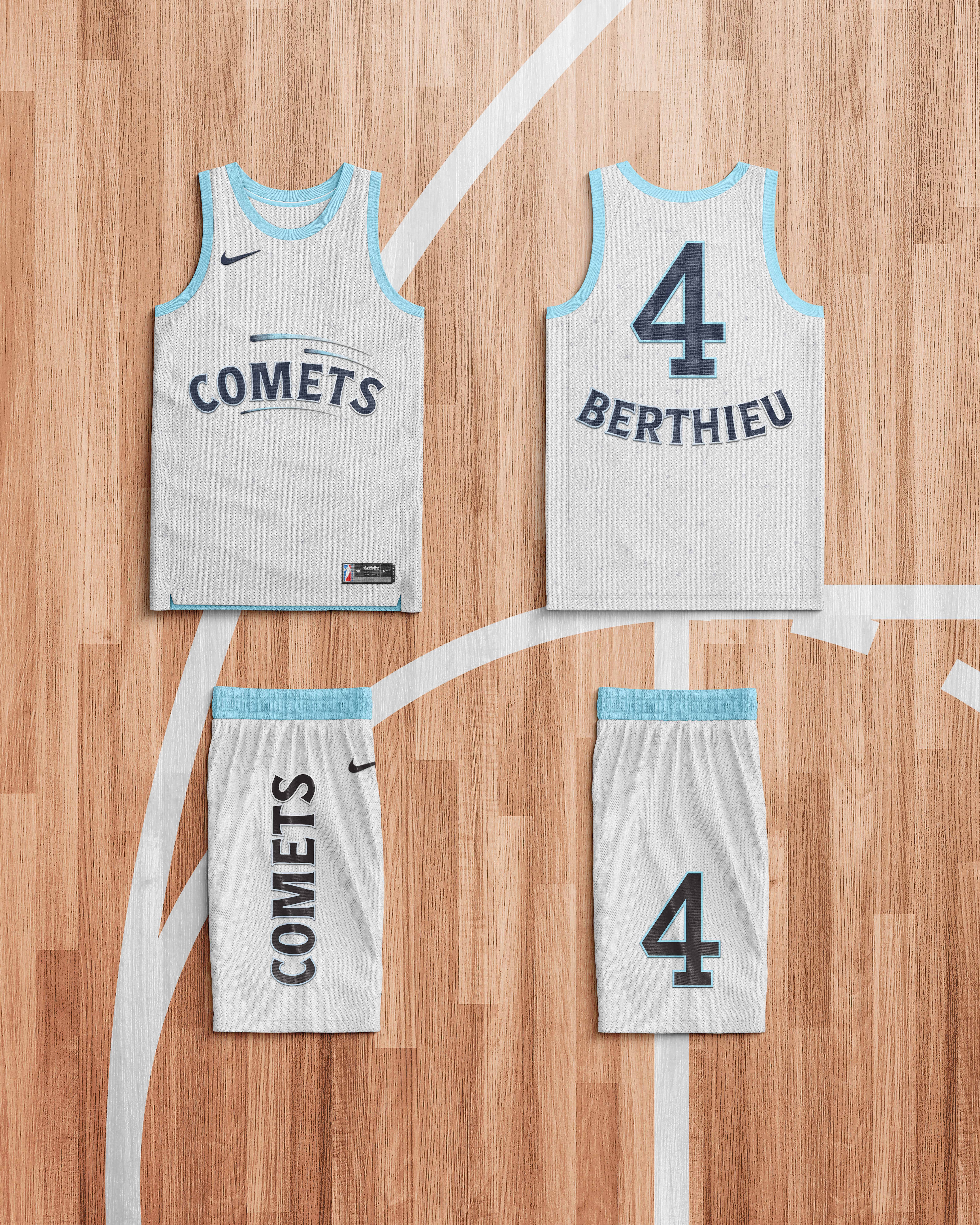
The rebrand is inspired by the Houston constellation, symbolizing guidance, strength, and brilliance. The new logo simplifies the identity to the word “Comets,” enhanced with gradient, stylized comet details to create depth and motion. The home jersey features a deep blue palette to emphasize the idea of the team as stars—bold, elegant, and shining as they approach—while the away jersey uses a softer, brighter base contrasted with dark lettering to convey strength, confidence, and victory. In addition to the logo and home and away jerseys, I designed supporting merchandise, as well as a still poster and a motion poster to announce the team’s rebranding and symbolic comeback. Together, the project celebrates the Comets’ legacy while positioning them as timeless, powerful, and ready to shine again.
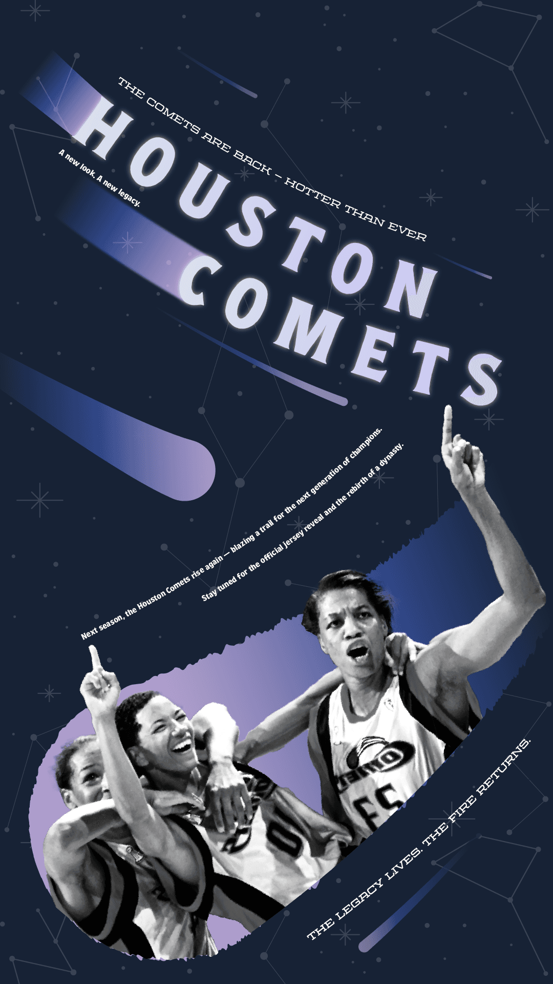
The rebrand is inspired by the Houston constellation, symbolizing guidance, strength, and brilliance. The new logo simplifies the identity to the word “Comets,” enhanced with gradient, stylized comet details to create depth and motion. The home jersey features a deep blue palette to emphasize the idea of the team as stars—bold, elegant, and shining as they approach—while the away jersey uses a softer, brighter base contrasted with dark lettering to convey strength, confidence, and victory. In addition to the logo and home and away jerseys, I designed supporting merchandise, as well as a still poster and a motion poster to announce the team’s rebranding and symbolic comeback. Together, the project celebrates the Comets’ legacy while positioning them as timeless, powerful, and ready to shine again.
The rebrand is inspired by the Houston constellation, symbolizing guidance, strength, and brilliance. The new logo simplifies the identity to the word “Comets,” enhanced with gradient, stylized comet details to create depth and motion. The home jersey features a deep blue palette to emphasize the idea of the team as stars—bold, elegant, and shining as they approach—while the away jersey uses a softer, brighter base contrasted with dark lettering to convey strength, confidence, and victory. In addition to the logo and home and away jerseys, I designed supporting merchandise, as well as a still poster and a motion poster to announce the team’s rebranding and symbolic comeback. Together, the project celebrates the Comets’ legacy while positioning them as timeless, powerful, and ready to shine again.
